Redecorate the artist’s Bedroom in Arles using elements from Van Gogh’s other paintings. (This is a discussion of an in-progress project.)
About twenty years ago, when I was young and in college, I spent my spring break editing Van Gogh paintings in Photoshop. I removed the backgrounds from several of his paintings, leaving vases of flowers, piles of shoes, and even cows on transparent backgrounds.
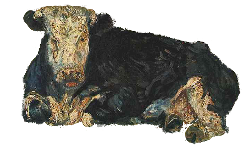
The cow on a transparent background
My goal was to build a drag-and-drop app that would let people redecorate the artist’s Bedroom in Arles using elements from Van Gogh’s other paintings. It would be possible, for example, to replace the painting over the bed with Starry Night. Or substitute a stack of books for the washstand’s basin and pitcher.
I never completed the app, although I started several iterations in various technologies du jour. I’m not a programmer. I do write code, but it’s always born out of frustration because I can’t find a way to do whatever I’m trying to accomplish any other way. I do everything I can to avoid code, but sadly my vision combined with my stubbornness forces me to coding on a semi-regular basis.
At DevLearn 2012 I saw a new tool, ZebraZapps, that allowed users to build sophisticated interactions without writing code. Instead it uses ‘wires’ to join objects together. Each object has properties you can manipulate through menus. Objects also have methods, known as IN and OUT wires, that can connect to other objects to make things happen. As a quick, non-exciting example, the Untitled button in the picture below has an out wire that feeds into a slider. When you click the button the slider moves up a notch. When you reach the top of the slider, a new OUT wire connects to a rectangle (currently not visible) and changes the rectangle’s visibility property to true so it appears on screen. The slider’s slide-value property is also connected to a text box which tells the user what notch the slider is currently occupying.
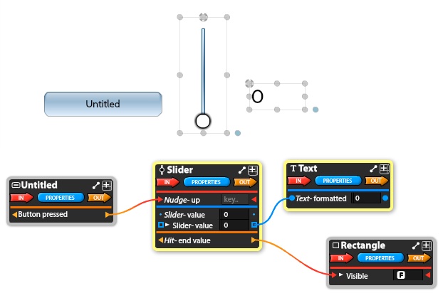
ZebraZapps uses message centers to access the object’s properties and methods, and wires to connect objects to each other.
My department at Large Conservative Maroon University bought a license for me to work with, and I realized this is the perfect technology to use for my Van Gogh project. I unzipped my 20-year-old Photoshop files, and was able to throw together a working example in a single evening.
Wow. No syntax errors to fight. No confusing code references to cry over. No endless Googling in hopes that someone else encountered the same cryptic error message I encountered. MIND. BLOWN. It was so easy, and so rewarding to see a 20-year-old idea finally come to life.
Now that the technical issues are out of the way I can focus on the interface. I’m verging on making what is potentially a bad choice.
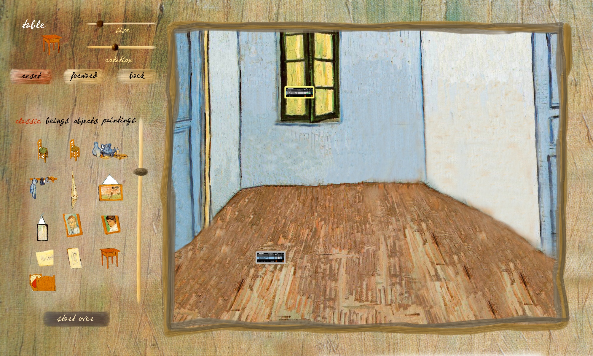
My Van Gogh interface
I think the kindest thing I can say is that it’s retro. It feels like it belongs to the early days of CD-ROMs, when Microsoft sold multimedia CDs. Of course their CD interfaces were better designed than my interface!


I’d hesitate to call this skeuomorphic, but it’s close kin. All the stone buttons and the tree-ring timeline. They aren’t imitating real-life objects like a skeuomorphic design would, but they’re certainly adding decorative flounces in an effort to accessorize the content.
I’m doing the same thing. My sliders look like streaks of paint, and since I’m old enough to remember when that was cool that makes it automatically uncool. If my niece Robin made this interface it would be ironic and cool, but since I’m the creator it’s sad.
I don’t know, I keep fighting with this. I want to keep the interface simple, but I also want to do what the Microsoft team did — celebrate the content! Be immersive. Be fun. Be tactile. So I have this strange combination, where I’m using neutral browns to keep the bedroom from being overwhelmed, but at the same time I’m using distracting painterly interface elements. (Distracting according to skeuomorph haters.)
Part of me thinks I should ditch it all and go with a minimal, flat interface. Be all 2014, ya know? But another part of me is enjoying this, and I want to pump up the volume and make the interface more colorful. After all, Van Gogh wasn’t shy about color. Why shouldn’t I embrace that?
And why does this matter anyway? This is for me, not a client. I can have bad taste on my own projects, can’t I? Am I that hung up on other people’s opinions?
I’m going to walk away from this for a few days. I need the perspective shift that time can provide.